

UniCore App
UniCore allows for strength training to be more approachable at Gregory Gym at the University of Texas at Austin. With personalized plans, tutorials, and gym integration, the app helps users of all experience levels feel confident, informed, and supported in achieving their goals.
Class Project: Interaction Design
Duration: 4 months (September 2024-December 2024)
Tools Used: Figma, FigJam, UserTesting.com, Google Forms
Team Roles: 2 UX Designers, 1 Accessibility Specialist, 2 UX Researchers (including myself)
Project Overview
Purpose: Designed a weight training app for UT Gregory Gym to support diverse fitness needs and scale across gyms.
Target Audience: UT students, faculty, and staff, including beginners, intermediate, and advanced users
Scope: 5 main features:
Custom workout plans
Tutorials
AI-powered plan generation
Awards and badges
Crowd history
Research Methods: Surveys, competitive analysis, affinity diagramming, and storyboarding
Role: UX Researcher and Designer
Designed and analyzed surveys
Led user flow design for gym info access
Conducted 5 usability tests
Contributed to affinity mapping and competitive analysis
Here is a link to our full project documentation.
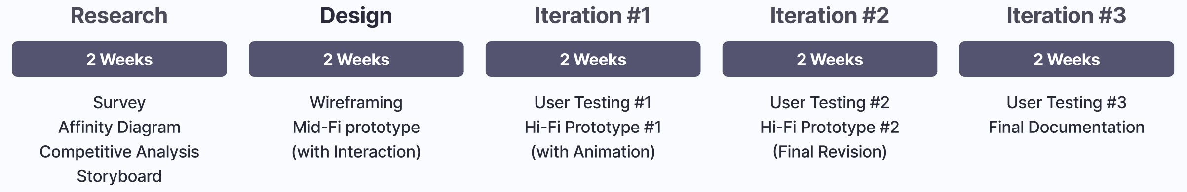
Project Timeline
User and Stakeholder Research
Survey
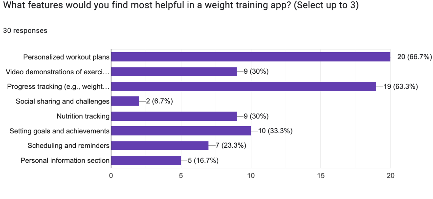
Why Survey? We chose a survey to gather quantitative data from a larger sample, which provided broader insights than user interviews would have allowed within our time constraints.
32 surveys were taken ranging in
Age: 18-34 years
Experience: Beginner, Intermediate, Advanced
Fitness App Experience
The questions focused on workout frequency, skill level, pain points, tracking habits, and likes/dislikes of current fitness apps.
Results: Feedback revealed key user needs and frustrations, guiding our design around several core components:
Workout personalization
Tracking and logging
Machine tutorial
Gym Information
App Integration
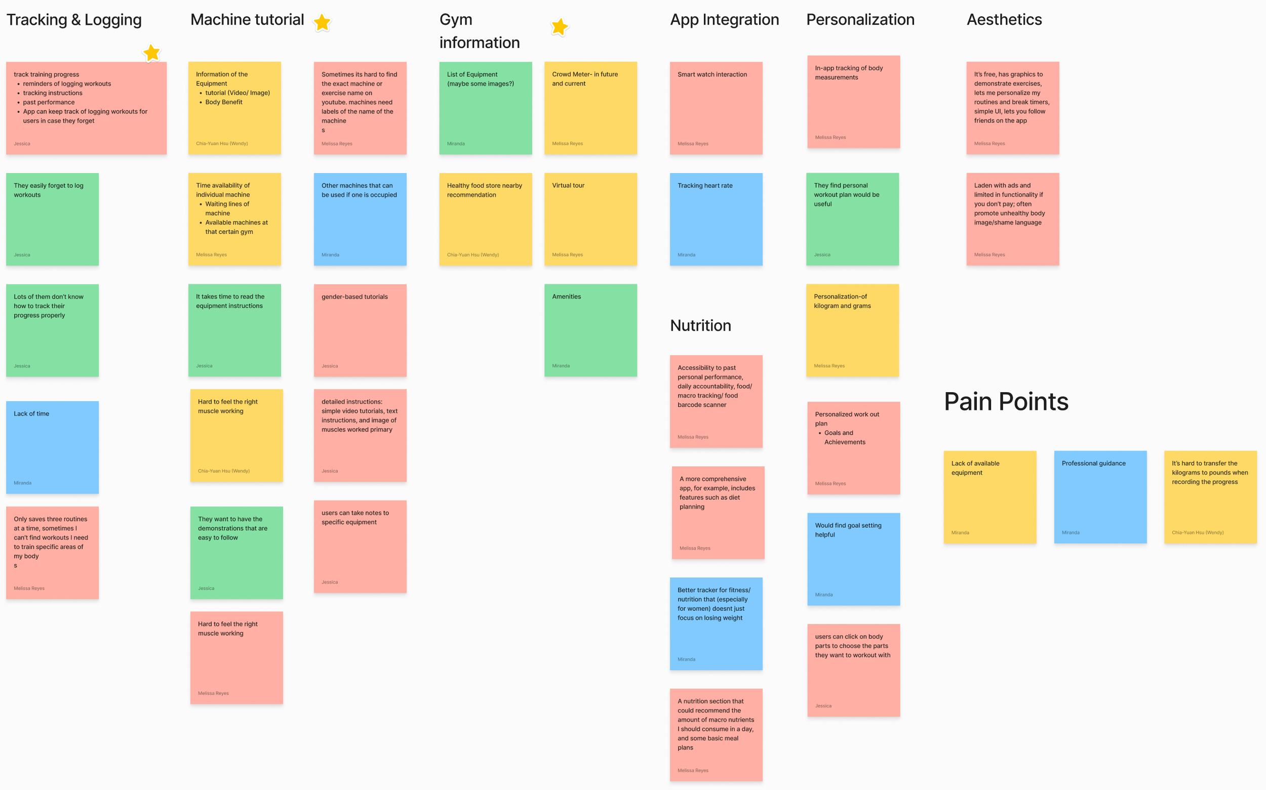
Affinity Diagram
From our analysis, we found that most ideas centered around five key features:
Personalization: Users wanted customizable units, the ability to log body measurements, receive personalized workout plans, and earn badges for achievements.
Tracking & Logging: Participants emphasized intuitive progress tracking and access to past performance data.
Machine Tutorials: Users requested clear equipment labeling, multiple tutorial formats (video, text, image), and real-time machine availability.
Gym Information: Feedback highlighted interest in a crowd meter, equipment lists with visuals, and general gym details.
App Integration: Users wanted connectivity with other fitness apps and smart devices such as watches.
Although users emphasized the importance of incorporating a nutrition feature into the app, we collectively decided to maintain our focus on the core purpose of the app.
We addressed their concerns for nutrition by making sure our app can link to some of the best nutrition apps.
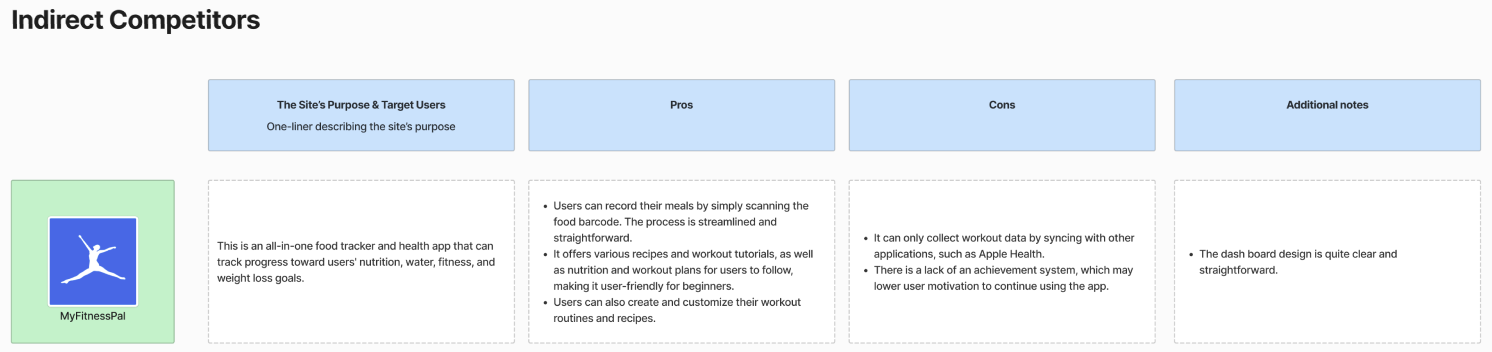
Competitive Analysis
Results: Testing different apps revealed patterns, strengths, and areas for improvement that guided our feature choices, including:
Integration with other apps and devices
Clear workout logging and progress tracking
AI-generated personalized workout plans
Multiple machine tutorials with steps and tips
Anatomical model for targeting muscle groups
Achievement badges
Notes section for each machine
Gym info (crowd levels and equipment availability)

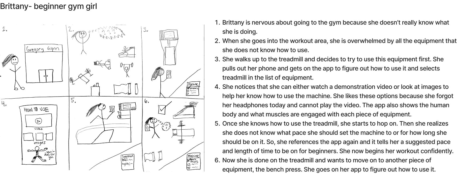
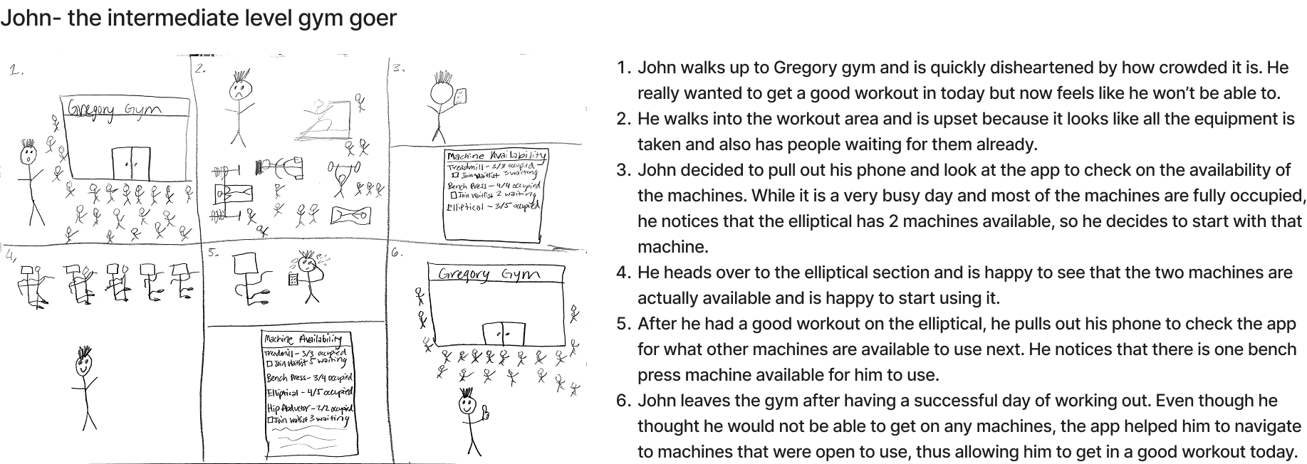
Storyboard
From my two storyboards on machine tutorials and gym information, our discussion led to several key ideas:
Multi-format machine tutorials (video, text, and images) covering setup, proper use, and target muscle areas to help users understand where they should feel the exercise.
Real-time machine availability, allowing users to plan workouts around open equipment through the use of body sensors on gym machines.
Here is a link to our storyboard page to view our entire storyboard collection.
Design, Implementation, and Testing
We organized our design into 6 main flows, which helped us divide group work and later served as the basis for user testing tasks.
Onboarding process
Access to gym information (Main flow I worked on in the group)
Access to a tutorial / history of an equipment
Create a workout plan with AI feature and edit it
Complete a workout plan
Check out the user’s profile and achievements
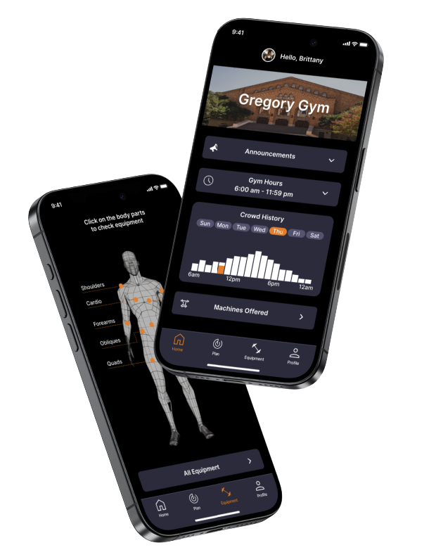
In this section, I’ll showcase the designs, prototypes, implementation, and testing for the flow I worked on: accessing gym information.
Mid-Fi Prototype
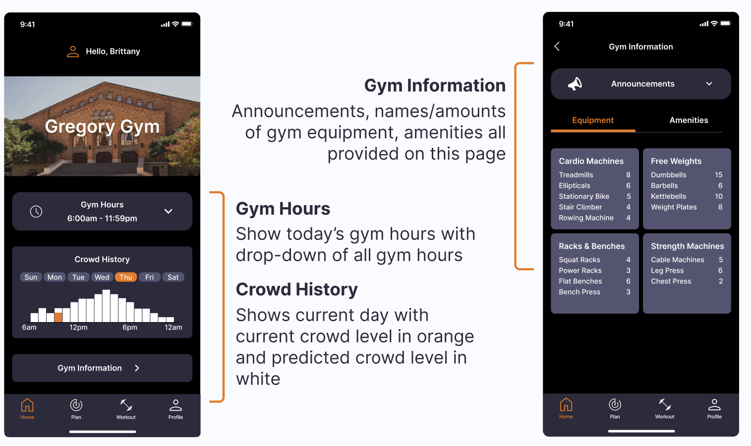
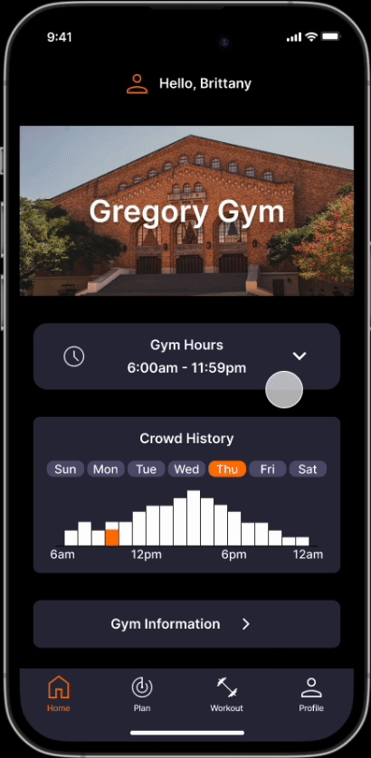
Home Page Goal: Create a simple, easy-to-understand layout that keeps users up to date with Gregory Gym.
My Design Decisions:
Gym Hours: Default shows today’s hours, with a dropdown for the full schedule.
Crowd History: Graph displays current crowd level compared to typical trends, helping users avoid peak times. The high-fidelity version will expand this to all days of the week.
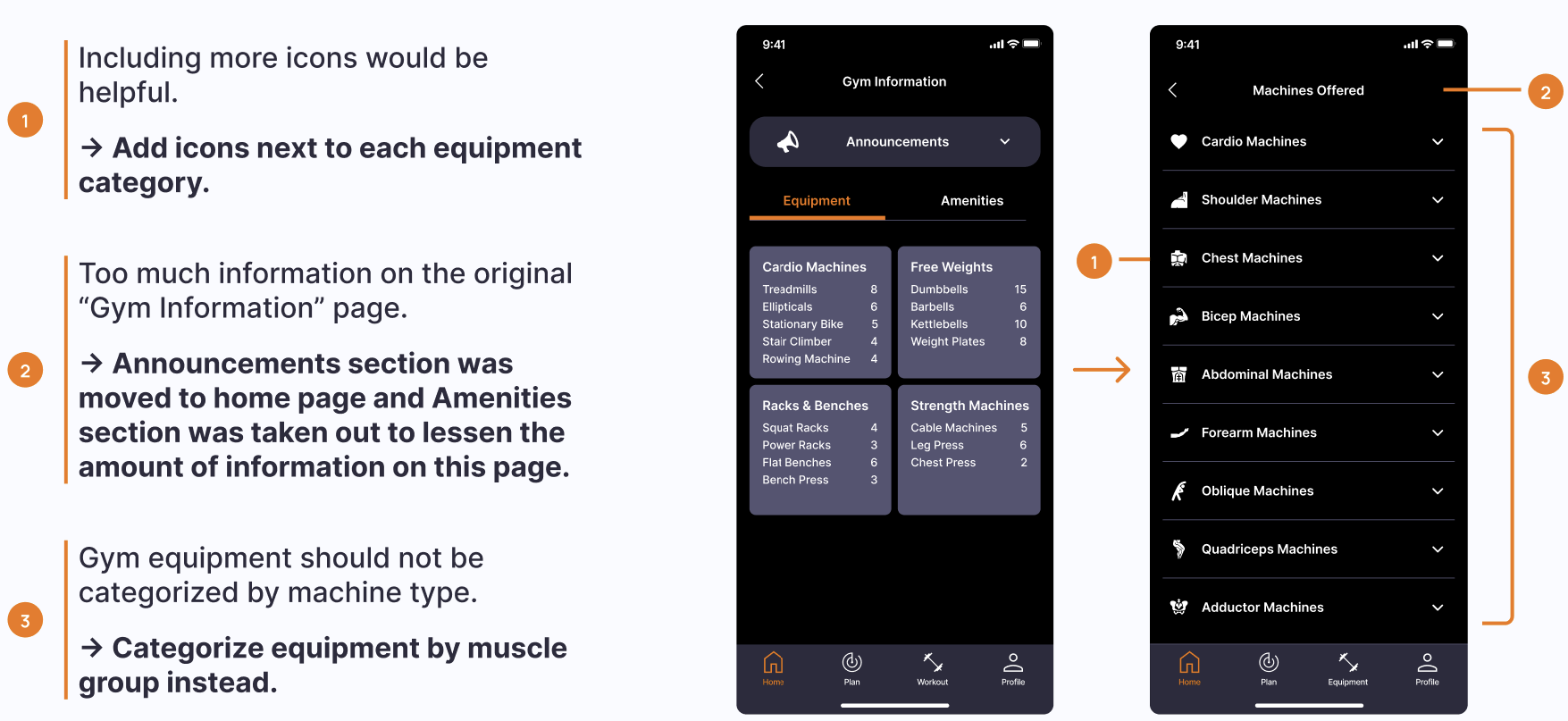
Gym Information: A separate page includes announcements, equipment availability, and amenities. We kept this off the home page to avoid clutter.
User Testing
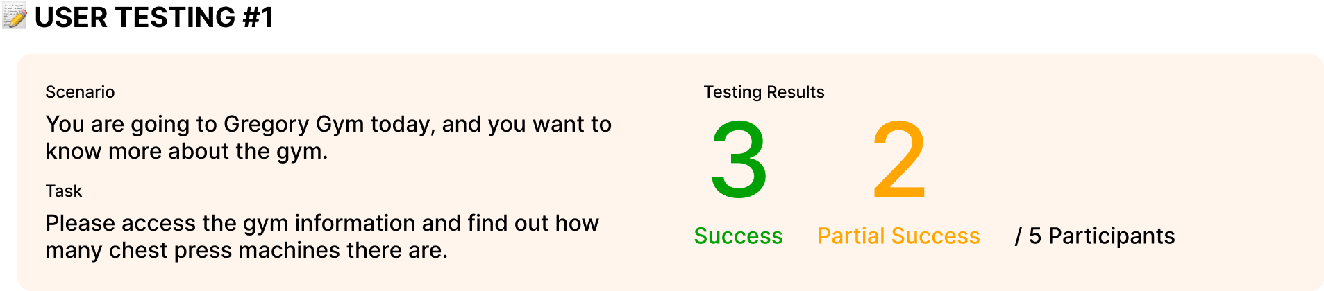
User Feedback and Insights (Round 1):
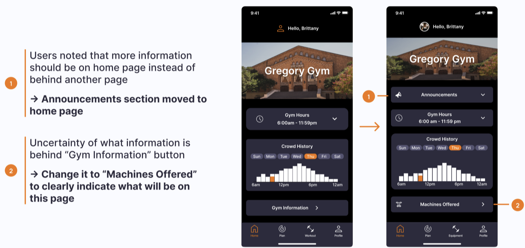
Home Page: Layout felt confusing; users wanted announcements and more info shown directly on the page.
Gym Hours: Today’s date/hours should be more obvious.
Gym Information Page: Too much content; suggested categorizing equipment by muscle group and questioned the value of amenities.
Icons: Users wanted clearer icons, especially for the gym information button and section.
Why were some users only partially successful?
They clicked the “Workout” tab to find chest press machine totals, suggesting the “Gym Information” tab needs a clearer, more descriptive label.
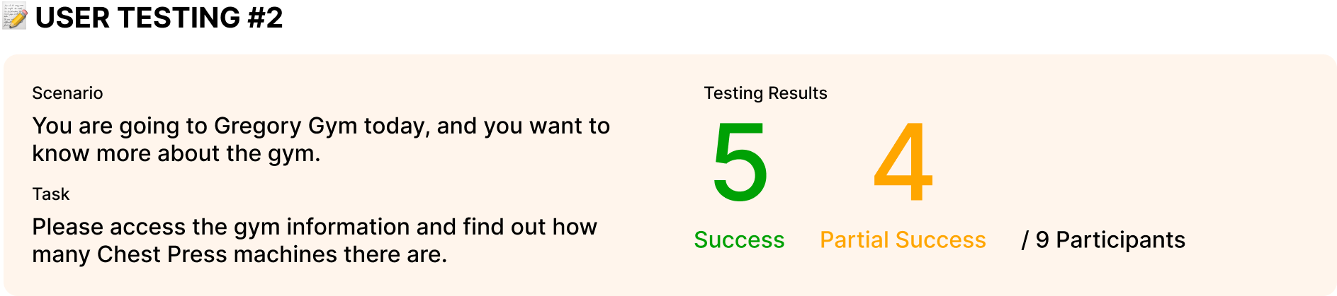
User Feedback and Insights (Round 2):
Overall Design: Pages felt easy and intuitive, with a clear layout, helpful icons, and well-labeled sections.
Future Suggestions: Add a calendar on the home page to track completed workout plans and include a live crowd line on the crowd history meter.
Why were some users only partially successful?
They looked under the “Equipment” tab to find the total chest press machines. This suggests the app should allow both the “Equipment” and “Gym Information” tabs to provide that information.
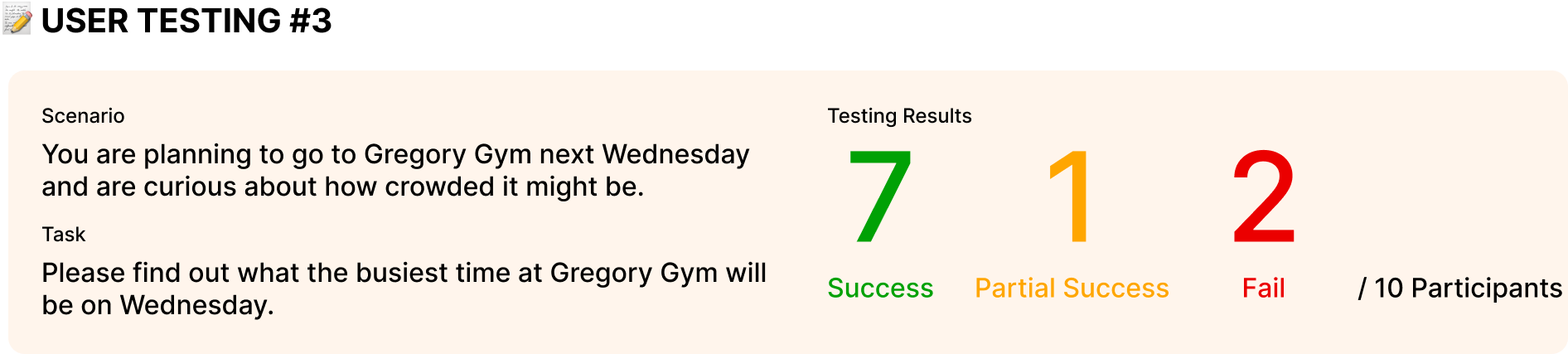
User Feedback and Insights (Round 3):
Crowd Meter Layout: Clear and simple, but time intervals felt too wide. The orange “Thurs” label caused confusion with the orange bar at 10am.
Crowd Meter Movement: Users were unsure why the graph reset to Thursday after moving the mouse away.
Why Users Failed: Many didn’t notice the graph resetting to Thursday after moving their mouse away. While the intent was to default back to the current day, users often moved their mouse unintentionally. This showed the need to keep the graph fixed on the selected day instead of auto-resetting.
Implementations
Future Improvements
In the future, we would hope to include the following features:
App Functions
Introductory tutorial page for onboarding
More intuitive crowd-level graph
Home page calendar to track completed workout days
AI Functionality
Show daily workout focus after plan generation
Allow users to view and edit the data used by the AI (similar to ChatGPT’s memory function)
Aesthetics & Motivation
Goal-setting options
Engaging animations
Progress rings for wearables (e.g., Apple Watch)
Weight Training Tools
Support for free-weight exercises
Timer for sets and rest periods
Key Takeaways
Stay Open to Improvement: Initial designs may be less intuitive than expected; user testing reveals what works and what needs refinement.
Ensure Transparency: Clearly communicate how user information is used, such as personal data powering AI-generated plans, and provide an opt-out option.
Pay Attention to Task Wording: Poorly worded tasks lower success rates by shifting focus from completing tasks to interpreting instructions.
Limit Instructional Text: Users often overlook long instructions; designs should guide without relying on text alone.